Today I saw a Reddit post where someone had hand-traced some elevation profiles across South Africa. I thought it looked rather similar to the iconic Joy Division album cover that give Joy Plots their name, so I decided to give making a nicer map (to me) a go.
Since I have the SRTM DEM for South Africa, I already had good resolution elevation data (especially for something that would cover the whole country). The following is a brief description of how to generate a similar plot in QGIS, based on a twitter thread of Mathieu Pellerin’s (although I only noticed the first reply and worked out a workflow of my own from there).
- Load your DEM (in my case I loaded all the DEMs and then merged them).
- Go to
Vector>Research Tools>Create Grid... - Set your horizontal and vertical spacing (I used 0.5 degrees vertically and 0.01 degrees horizontally). Keep it as a
Pointgrid, and generate the new layer. - Open the toolbox and find the
Sample raster valuestool. Select the DEM as the raster to sample, and your created grid points. This will create a new layer with the value of the raster at each grid point. (Said raster could be anything, I just happen to be working with elevation.) - Once the sampled points are created, we need to style them.
- Select the standard
Simple Marker. - We will add a data-defined override to the offset, in mm:
- The expression that I used was
concat('0,', -"elev_1"/500). This creates a string, with ax-offsetof 0, and ay-offsetof the elevation divided by 500.
- The expression that I used was
- This expressions means that higher elevations will be further from the point’s real position. Tweak the amount you divide by to fit your spacing, how flat your topography is, and how large your area is. The bigger this number, the flatter the profile line will be.
- I also used a data defined override on the colours, colouring each point by the elevation value.
- Select the standard
- We can then do the same for a vertical plot, using 0.5 degree horizontal spacing, 0.01 vertical (along the line). The override expression needs to be changed to
concat("elev_1"/500, ',0')or whatever you used for your one.
(My approach differs from Mathieu’s in that my points are only moved as a rendering option, not actually translated. This is probably easier to fiddle with and change scaling and so on. On the other hand, making them actual lines means that the final product will be smoother; if you look closely, there are some gaps in my lines of points that would not exist if you converted them to lines.)
All of that got me these maps:
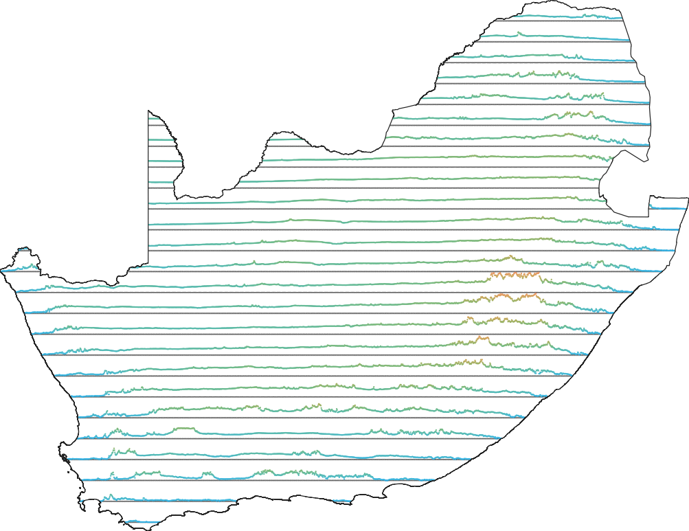
Horizontal SRTM-derived Joy Plot. 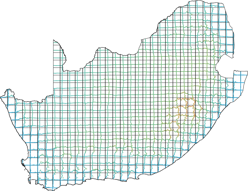
Bidirectional SRTM-derived Joy Plot.
I shared it over in the Spatial Community’ #cartography-designs channel, and Nick Santos mentioned that the bidrectional one reminded them of an oscilloscope. Well, that is just a case of needing more lurid green on a black background, right…?

I also tweaked the spacing a little, and made this one. The gap between lines is too narrow (on screen, perhaps) to work well with a bidrectional plot, but it works well on screen.

I hope that these maps have given you some joy at least. Happy mapping.